The Mendocino Voice | Mendocino County, CA
(https://mendovoice.com/2021/03/surge-ends-and-red-tier-is-in-sight-for-mendocino-newsom-announces-new-vaccine-policy-loosening-of-restrictions/)
Surge ends and “red tier” is in sight for Mendocino — Newsom announces new vaccine policy, loosening of restrictions
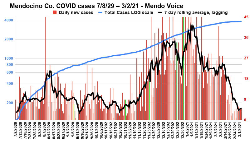
This graph runs from roughly right after the first surge began till the present. It shows total case count in (left axis) in a logarithmic scale. Log scales are useful for showing data sets with a big spread, and areas of exponential growth. In a log scale linear growth is a curve with a quick growth followed by a gentle, flatish, upward growth (basically the mirror image of exponential growth in a linear plot). On the other hand exponential growth looks like a steeply sloping up straight line. As this graph demonstrates well, there have been moments where growth in cases becomes exponential, followed by times when we successfully "flattened the curve" and went back to slow linear growth. On the right axis are the daily increases, as well as a 7 day lagging rolling average of increases. The green lines are holidays: Labor Day, Halloween, Thanksgiving, Christmas, New Year's.
WILLITS, 3/4/21 — In a statement made Tuesday Mendocino County Public Officer Dr. Andy Coren said that “red tier is getting closer,” pointing to March 16 as a possible date. However, late last night Governor Newsom announced a policy shift that will make scaling back restrictions quicker, and easier. He also said that the state would be reserving 40% of vaccines in California for low income communities — likely including Willits, Covelo, and parts of Ukiah.
This morning the county announced a single new case of COVID-19 had been confirmed yesterday, and while Coren has cautioned that this lower rate is in part due to a serious drop-off in testing numbers, it is nonetheless apparent that the scourge of the winter surge has passed and the rate of COVID infection has seriously decline across the state — at least for now.
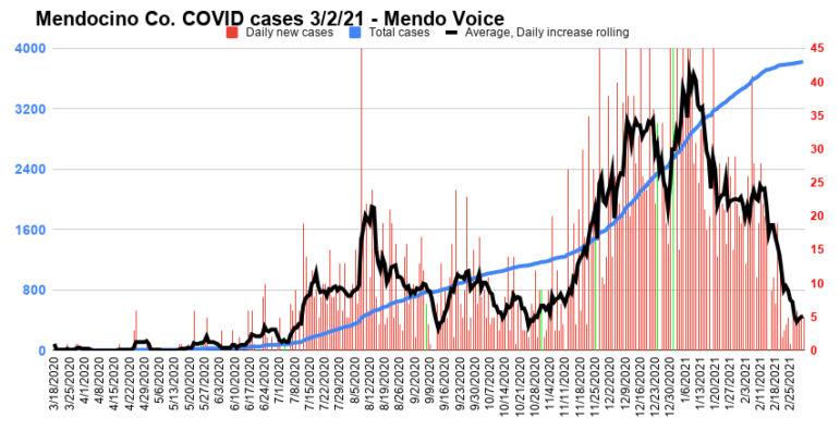
This graph shows total case count on the left axis. On the right axis are the daily new cases, as well as a 7 day, lagging, rolling average of daily increases. The green bars are holidays, beginning on the left with Memorial day, then Independence Day, Labor Day, Halloween, the day before Thanksgiving (no numbers were available on Thanksgiving), Christmas Eve, and New Year’s Eve. A fairly obvious pattern of surges following holidays is evident. Since the end of the holiday season, and the change in the weather, cases have crashed.
Said Coren in his statement, “Red tier is getting closer. Remember the state has to see red tier metrics for two weeks to put us into red tier. If we see no more outbreaks or rise in cases, we may enter red tier formally as early as 3/16. However, we cannot afford to be lax in masking, social distancing, hand-washing, avoiding gatherings outside our household — since we have a small county and very few positive cases can keep us in purple longer. We won’t need a new order, but I plan to issue new guidance since there have been and I expect more changes at the state level.”
Advertisements
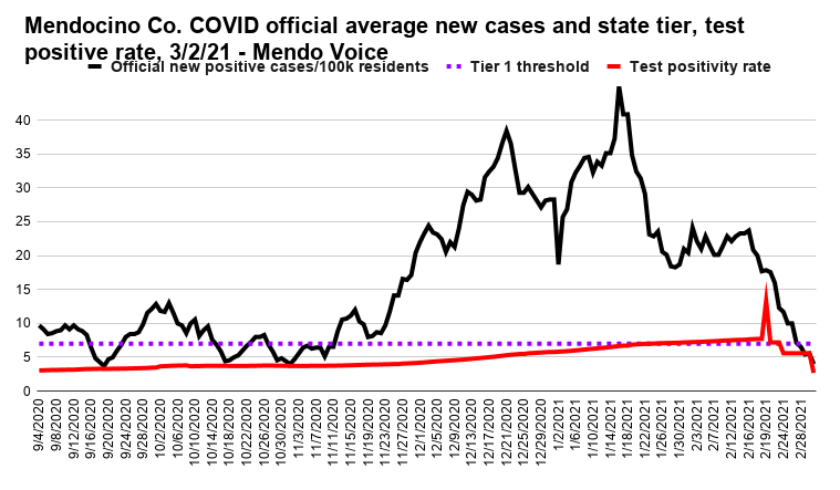
This is the official information from the state about percentage of tests conducted daily that come back positive, and the number of new cases per day. The state uses the average number of new cases per day normed to per 100,000 people rate, on a seven day lagging average, and the positive cases as the determiners of which “tier” the county sits in.In the past few days the county has dipped below the “purple tier” level in cases per day. In the past weeks the percentage of tests that come back positive (seen in red) dropped from purple to red, and is now in orange.
As always, the details of Newsom’s policy are somewhat arcane. Since vaccination efforts began late last year wealthier and whiter communities have grabbed up the lions-share, often bypassing communities high in so-called essential workers. In and effort to redress this inequity (and to speed dispersal of vaccines to the people who actually do essential work) the state has identified 450 low-income ZIP codes and will reserve 40% of all vaccines for people in those areas. It appears that Willits, Covelo, communities in northern Mendo, and parts of Ukiah are in this classification.
In total 8 million people reside in these areas or 20% of the state. Once a quarter of those people (2 million) are vaccinated the tier thresholds will be adjusted, with the purple tier threshold moving from 7 new cases per 100,000 people per day, up tot 10 new cases. However, Mendocino may well clear the easier threshold before the vaccination goal is accomplished.
Advertisements
Already about 20% of Mendocino residents have received at least one dose of vaccine against the coronavirus disease — and about 4.4% of the county’s population has tested positive for COVID. After repeated requests the county has still not offered a substantial demographic breakdown of who has received the the vaccine.
Vaccination is open to people 65+ and a variety of positions, including food workers, agricultural workers, people in the timber industry, and of course medical workers. It is unclear if this new allocation of vaccines will materialize or if it will result in a change in vaccine tiers.
Graphs
Now that the worst of the surge is behind us, it’s a good moment to review the data on the past year of infections.
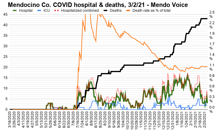
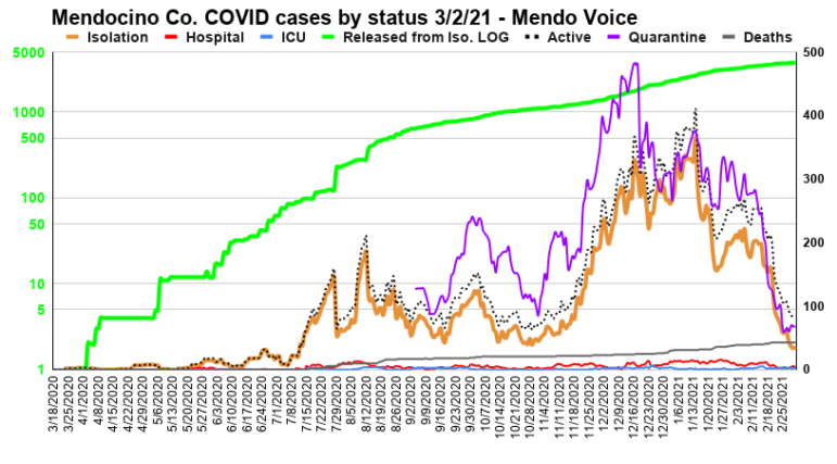
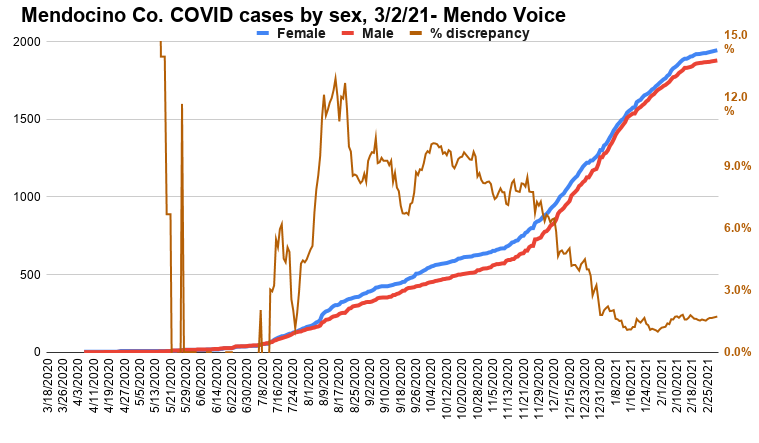
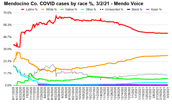
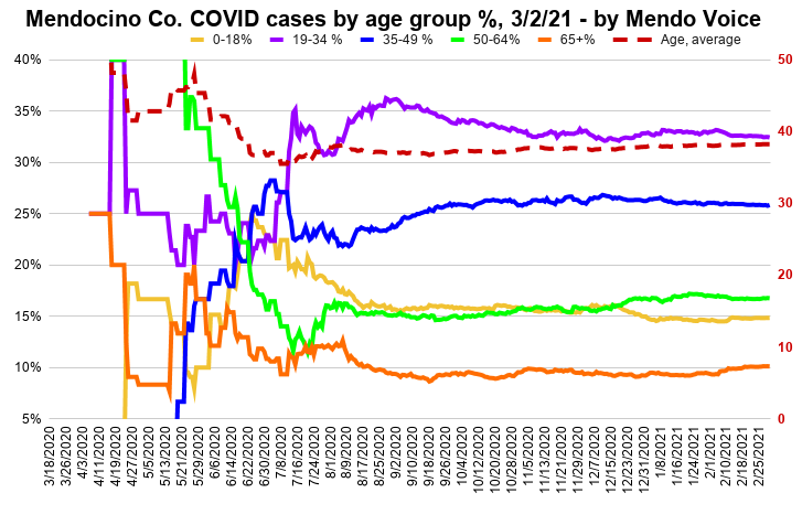
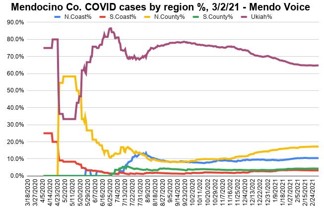
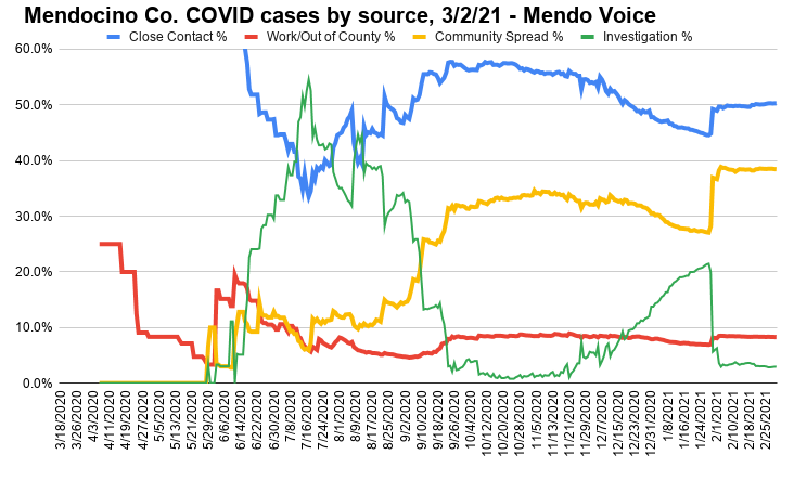
This graph shows people in regular hospital beds in green, people in the ICU in blue, and deaths in black. The dotted red line is the sum of normal hospitalizations and ICU patients giving total people in hospital. The orange line is the percentage of total recorded cases to date who have died. This number is a bit misleading because of the lag-time between contracting the virus and dying. However, even adjusting for the delay the death-rate remains quite low in Mendocino Co. as compared to other parts of the nation and world.This graph shows the count of people hospitalized, in the ICU, in isolation, killed, and released. In addition there is a line called “Active Cases” which combines all statuses except releases. This last category is to provide a nice contrast between releases, and cases of current concern and deaths. It also includes a count of people in quarantine (that is, people who may have been exposed to COVID but have not tested positive or negative). Presented along the left axis in green, in log format, is people released from isolation because as more people are infected the number of people released will steadily go up and dwarf the other statuses, making the graph otherwise unreadable.This graphs shows the growth of total cases broken down by sex. In orange is the disparity in the number of males vs. females, plotted against the right vertical axis, as a percentage. This difference is important to observe as the number of women infected has steadily been higher. However, since the winter surge men have contracted the virus at a higher rate, bringing the gap down.Here are cases split by percentage of the total cases, broken down by race. Though Latinos make up only about a quarter of Mendocino County’s population, they are overwhelmingly the largest number of cases. Since the winter surge, though, whites have actually contracted the virus at a higher relative rate.Cases by percentage of the total by age group.This graph shows the percentage of cases in each region of the county. Earlier in the pandemic, due to the low numbers, small changes in numbers resulted in big fluctuations in the percentages, but as the case count grows the numbers have stabilized. The Ukiah area has about a third of the population of the county but a far greater number of cases.A breakdown by the percentage of the total cases acquired from the respective source. Close contact remains in the lead, and is mostly explained by close family members spreading within a household. The decrease in close contact since mid Nov. is mostly a result of the surge making it difficult to keep up with contact tracing. A major effort in contact testing in late Jan. led to clearer numbers, which showed a significant increase in community spread.
One thought on “Surge ends and “red tier” is in sight for Mendocino — Newsom announces new vaccine policy, loosening of restrictions”
“wealthier and whiter communities have grabbed up the lions-share”… nothing like a little race-baiting to stir up the anger while reading the news over morning coffee. With all the factual data presented it must have gotten boring writing this piece and a touch of political bias crept into it. Just for kicks, mind you.


“wealthier and whiter communities have grabbed up the lions-share”… nothing like a little race-baiting to stir up the anger while reading the news over morning coffee. With all the factual data presented it must have gotten boring writing this piece and a touch of political bias crept into it. Just for kicks, mind you.