The Mendocino Voice | Mendocino County, CA
(https://mendovoice.com/2021/06/one-more-covid-death-as-spike-continues-cases-identified-at-2-ukiah-bars-death-toll-hits-50-graphs/)
One more COVID death as spike continues — cases identified at 2 Ukiah bars — death toll hits 50 (graphs)
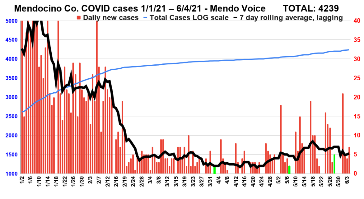
This new graph shows total case count on the left axis. On the right axis are the daily new cases, as well as a 7 day, lagging, rolling average of daily increases.As you can see, the past month or so shows an uptick in cases. However, there has been a dramatic decrease in testing rates since the end of the winter surge, and as such these new numbers must be taken with a grain of salt — the real infection rate is likely substantially higher.We've reset this graph to start on Jan. 1, 2021, to give a clear view of how the pandemic has progressed since the height of the surge just after New Years Day.The green bars are holidays (or the Friday before a holiday when data is not available for that day), first Easter then Mother's Day, then Memorial Day.In recent months the county has stopped providing data on weekend, and gives three days worth of data on Mondays, which produces the recurring blank followed by a spike pattern.However, the 7-day average line smooths this data gap out. (Graph by Adrian Fernandez Baumann)
MENDOCINO Co., 6/5/21 — We have entered a more complicated phase of the pandemic, while a majority of Mendocino County residents have been vaccinated, new more contagious variants, balmy weather, and a relaxation of public health rules are resulting in a significant new surge among the remaining unvaccinated portion of the population. As Mendocino County Public Health Officer Dr. Andy Coren has said repeatedly, there are now two different worlds: an vaccinated group who have almost no risk of serious illness, and an unvaccinated group who are still contending with the virus now in a more virulent form.
Yesterday it was announced that one of the latter succumbed to the disease, bringing the death toll in Mendocino County to 50 for about 1.2% death rate among confirmed cases. The public health department also announced that two bars in Ukiah, the Office and the Pub, are “confirmed to have three COVID-19 positive cases among customers,” and are urging anyone who visited these bars on May 22 or 23 to get tested for COVID and to watch for symptoms.
Advertisements
It is important that such testing occur so that possible new outbreaks can be staunched.
Here is a press release from Public Health:
Advertisements
Mendocino County Experiencing Surge in COVID-19 Cases, Multiple COVID-19 Positive Cases Identified at Local Bars, and Additional COVID-19 Death
COVID-19 cases and hospitalizations are on the rise in Mendocino County. Health Officer Dr. Andy Coren stated: “We are in a surge in Mendocino County. We have seen daily average case rates over 8 per day per 100,000 residents, and we see a concentration of positive cases in Ukiah, Redwood Valley, and Willits.”
The Office Bar & Bistro (131 E. Mill St) and The Pub (585 N. State St) have been confirmed to have three COVID-19 positive cases among customers who visited these establishments on May 22-23, 2021. Therefore, for anyone who has visited these businesses on these dates, it is recommended you get tested and closely monitor for signs and symptoms of COVID-19.
Mendocino County Health Officer Dr. Coren urges people to get tested if they show even mild symptoms, including allergy symptoms, to help us control the spread of COVID-19. In addition, he encourages frequent testing for those who are NOT vaccinated. Testing allows us to protect our loved ones and better understand how the virus is circulating in our communities.
What can Mendocino County residents and workers do to support our communities at this time? Dr. Coren continues to emphasize that getting the COVID-19 vaccine is the best way to protect ourselves against the virus and help our county stop the spread of the virus.
Advertisements
Along with the increase in cases came the very unfortunate news of an additional death from COVID-19 in Mendocino County on June 4, 2021 (not related to the bar cases). It is a sobering reminder that families and communities across the county need our support to stop COVID-19 and to begin to heal from the pandemic.
We ask that the community stay vigilant and follow the guidance outlined by the California Department of Public Health and Mendocino County Public Health. For more information about COVID-19 vaccines, testing, masking, and gatherings, contact the Mendocino County Public Health COVID-19 Call Center at (707) 472-2759 or visit our website at: mendocinocounty.org/community/novel-coronavirus.
Graphs
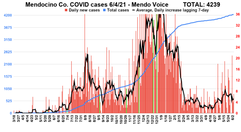
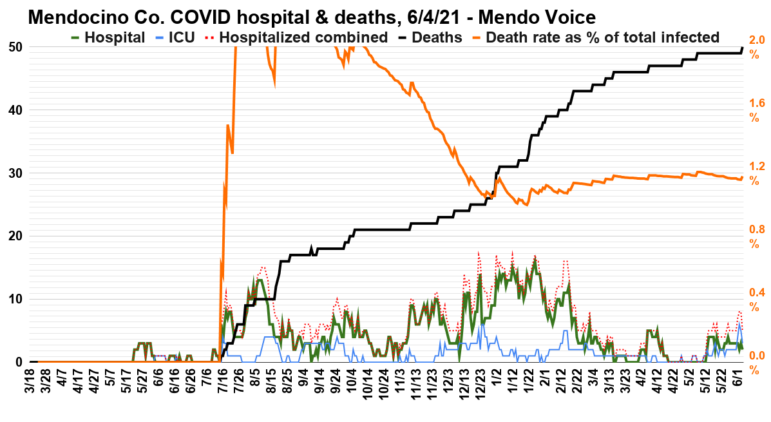
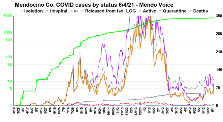
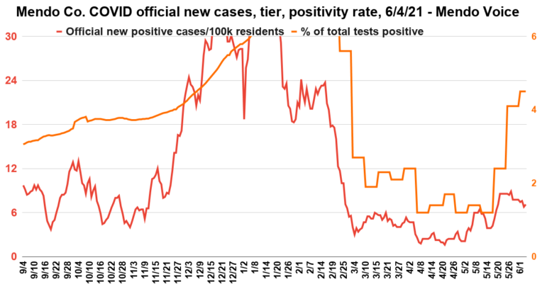
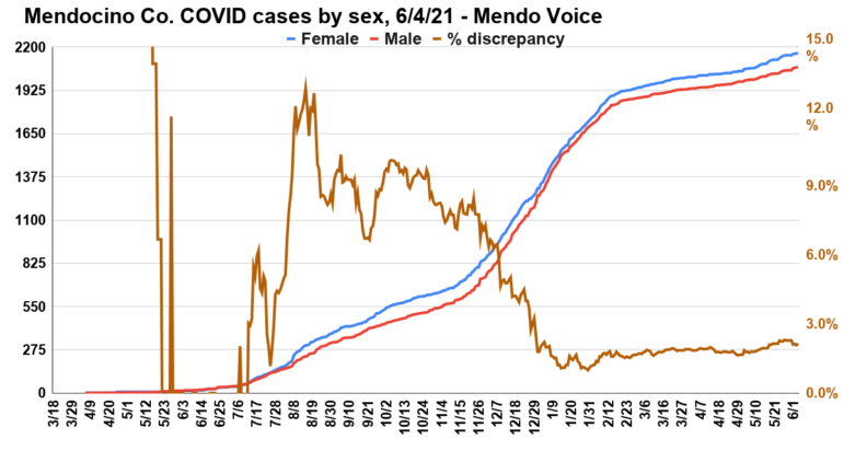
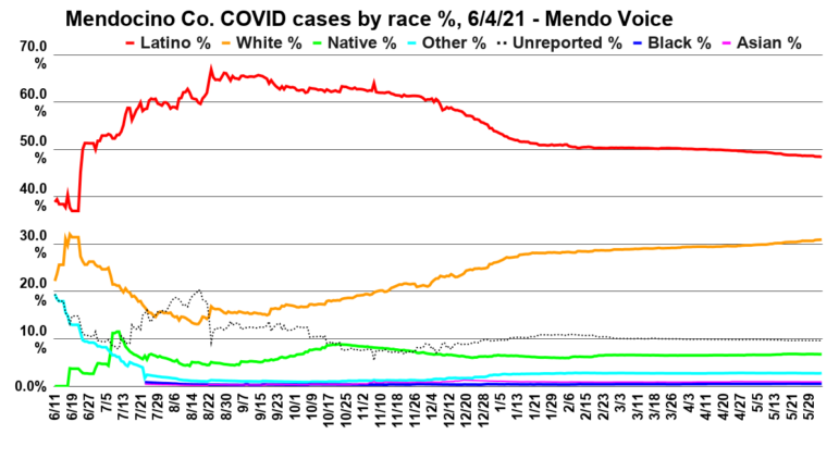
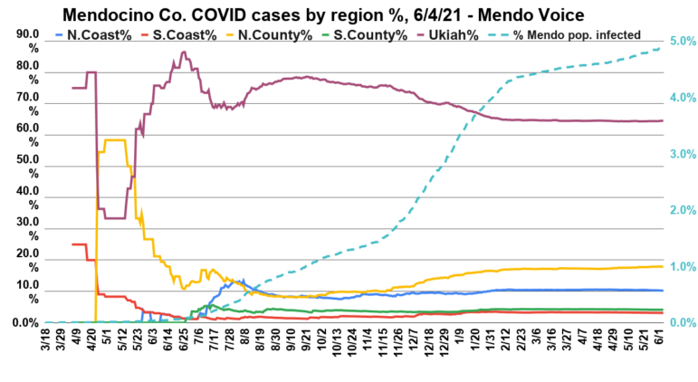
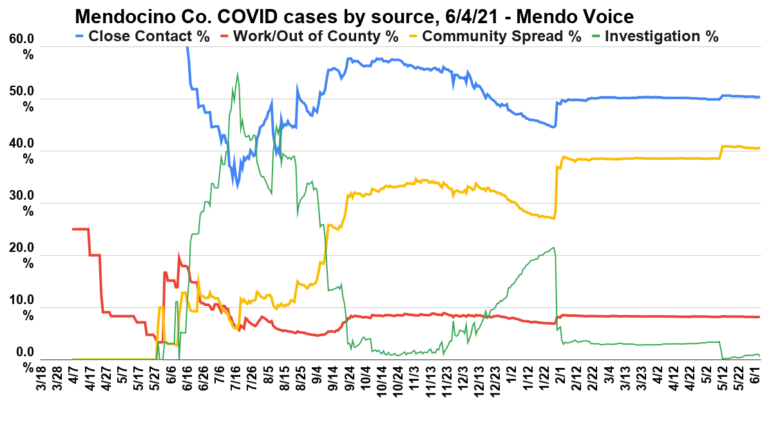
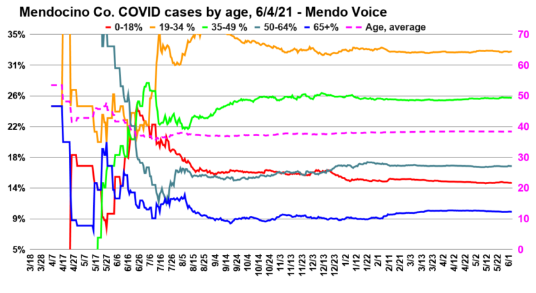
This graph shows total case count on the left axis. On the right axis are the daily new cases, as well as a 7 day, lagging, rolling average of daily increases. The green bars are holidays, beginning on the left with Memorial day, then Independence Day, Labor Day, Halloween, the day before Thanksgiving (no numbers were available on Thanksgiving), Christmas Eve, and New Year’s Eve. A fairly obvious pattern of surges following holidays is evident. Since the end of the holiday season, and the change in the weather, cases have crashed.Este gráfico muestra el total de casos en el eje izquierdo. En el eje de la derecha están los nuevos casos diarios, así como el promedio atrasado de 7 días del aumento de los casos diarios. Las barras verdes son los días feriados, comenzando en la izquierda con Memorial Day, luego el día de la Independencia, Labor Day, Halloween, el día antes de Thanksgiving (no hubo reporte de casos en Thanksgiving), la víspera de la navidad y las víspera del año nuevo. Un obvio patrón de aumento de casos es evidente. Desde el final de la temporada de las vacaciones y con el cambio del clima los casos han explotado(Graph by Adrian Fernandez Baumann)This graph shows people in regular hospital beds in green, people in the ICU in blue, and deaths in black.The dotted red line is the sum of normal hospitalizations and ICU patients giving total people in hospital. The orange line is the percentage of total recorded cases to have died.This number can a bit misleading because of the lag-time between contracting the virus and dying.A stable percentage of around 1% is in line with the rest of the state, and reflects improvements in treatment from the earliest days of the pandemic.This graph shows the count of people hospitalized, in the ICU, in isolation, killed, and released. In addition there is a line called “Active Cases” which combines all statuses except releases. This last category is to provide a nice contrast between releases, and cases of current concern and deaths. It also includes a count of people in quarantine (that is, people who may have been exposed to COVID but have not tested positive or negative). Presented along the left axis in green, in log format, is people released from isolation because as more people are infected the number of people released will steadily go up and dwarf the other statuses, making the graph otherwise unreadable. (Graph by Adrian Fernandez Baumann)This is the official information from the state about percentage of tests conducted daily that come back positive, and the number of new cases per day. The state uses the average number of new cases per day normed to per 100,000 people rate, on a seven day lagging average, and the positive cases as the determiners of which “tier” the county sits in. (Graph by Adrian Fernandez Baumann)This graph shows the growth of total cases broken down by sex on the left axis.In brown is the percentage disparity between males and females, plotted against the right axis. This difference is important to observe as the number confirmed infections among women has steadily been higher.However, it is also likely that women simply get tested at higher rates than men, and that this was especially true earlier in the pandemic. Since the winter surge men have at times been confirmed to have contracted the virus at a higher rate, bringing the gap down. Since the end of the surge the rates of male and female infection have become close to equal. (Graph by Adrian Fernandez Baumann)Here are cases broken down by race. Though Latinos make up only about a quarter of Mendocino County’s population, they have been the largest number of cases. However, since the winter surge, though, whites have actually contracted the virus at a higher relative rate. Latinos are still represented at roughly double the rate.This graph shows the percentage of cases in each region of the county. Earlier in the pandemic, due to the low numbers, small changes in numbers resulted in big fluctuations in the percentages, but as the case count grows the graphs have stabilized. The Ukiah area has about a third of the population of the county but a far greater number of cases.Plotted in a dotted blue line is the percentage of the population to have been confirmed to have been infected. (Graph by Adrian Fernandez Baumann)A breakdown by the percentage of the total cases acquired from the respective source. Close contact remains in the lead, and is mostly explained by close family members spreading within a household.The sudden stepping in the graph is a result of county health officials clearing large batches of cases previously labeled “under investigation.” (Graph by Adrian Fernandez Baumann)Cases by percentage of the total by age group. The dotted line is a guess at an average age, based on a weighted average of the totals in each group. (Graph by Adrian Fernandez Baumann)
4 thoughts on “One more COVID death as spike continues — cases identified at 2 Ukiah bars — death toll hits 50 (graphs)”
“As Mendocino County Public Health Officer Dr. Andy Coren has said repeatedly, there are now two different worlds: an vaccinated group who have almost no risk of serious illness, and an unvaccinated group who are still contending with the virus now in a more virulent form.”
This message needs to be repeated and repeated and repeated again to the point of extra redundancy.
We got the Vaxxed and then we’ve got the Un-vaxxed. Two widely different levels of risk. Which world do you inhabit?
I inhabit a world where I am in far more danger of being adversely affected by microvesicle shedding from the newly injected than I am of any “virus”—which, incidentally, has never been isolated and therefore has not been genetically sequenced, but you just go ahead and get that DNA altering shot (and the next one, and the next one, and the booster shots ad infinitum)…. Just don’t come near me.
How old was the person who died? Any co-morbidities? What kind of medical treatment? All those charts and graphs you love to publish are more useful as weaving patterns than infographics. This is the first time in modern history that “cases” equates to “illnesses” and a manufacturing process has been used to determine those “cases.” Welcome to Planet Dystopia.
Marilynn B couldn’t have said it better! All of this is just a scare tactic to get people to inject themselves with a rushed concoction of whatever bs they decided to mix together as a text study to see what works! I for one am not a crash test dummy. It’s like asking me to sit in the front seat of a car that is purposely going to crash into a wall at an extremely high rate of speed just to see what damages will come from it! Where are the statistics from the years of research and trials and test runs on this vaccine? What are the long term effects? To each his own! If you feel that getting vaccinated is best for you then so be it! However, don’t you dare judge me for standing by my personal belief that it isn’t for me!